Henrik R
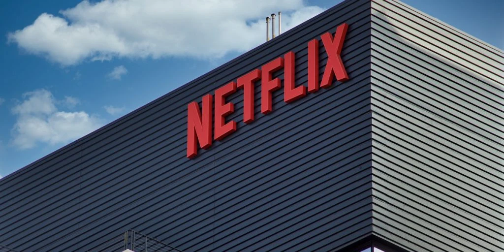
Viewers can’t believe how Netflix’s logo used to look like.


Netflix, the streaming behemoth, recently celebrated its 26th anniversary. Founded in 1997, the platform has undergone significant changes, including its original logo, which has left some viewers in disbelief.
Originally a DVD rental service, Netflix has evolved into a global streaming giant, but its first logo was far from sophisticated.
Designed in the 1990s, the original logo featured Word Art and a purple film reel separating the words “net” and “flix.”


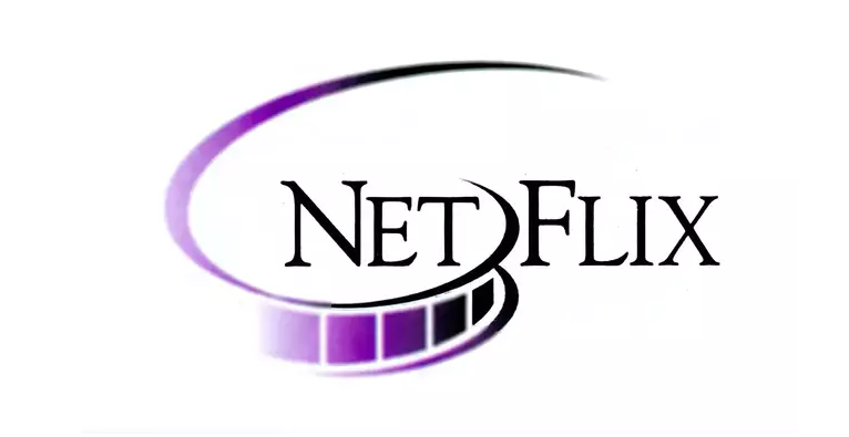
The original logo was a far cry from the sleek branding we associate with Netflix today. Created in the era of Word Art, the logo featured a purple film reel that divided the words “net” and “flix.” This design was short-lived and was replaced in 2002, but it has left a lasting impression on viewers.
The old logo has sparked a range of reactions on social media.
One Twitter user commented, “Omg it looks like a site that would give you a virus,” while another said, “It’s giving Microsoft word art porno company graphic.” Despite the mockery, the original logo had a unique feature: the capitalization of the word “Flix,” which was a nod to the platform’s original website, NetFlix.com.
Netflix has come a long way since its days as a DVD rental service. The company has not only transitioned to streaming but has also updated its branding multiple times. In 2014, Netflix introduced the red logo we are familiar with today, along with its ‘N’ emblem, which is now used on the app’s icon.